Key Takeaways
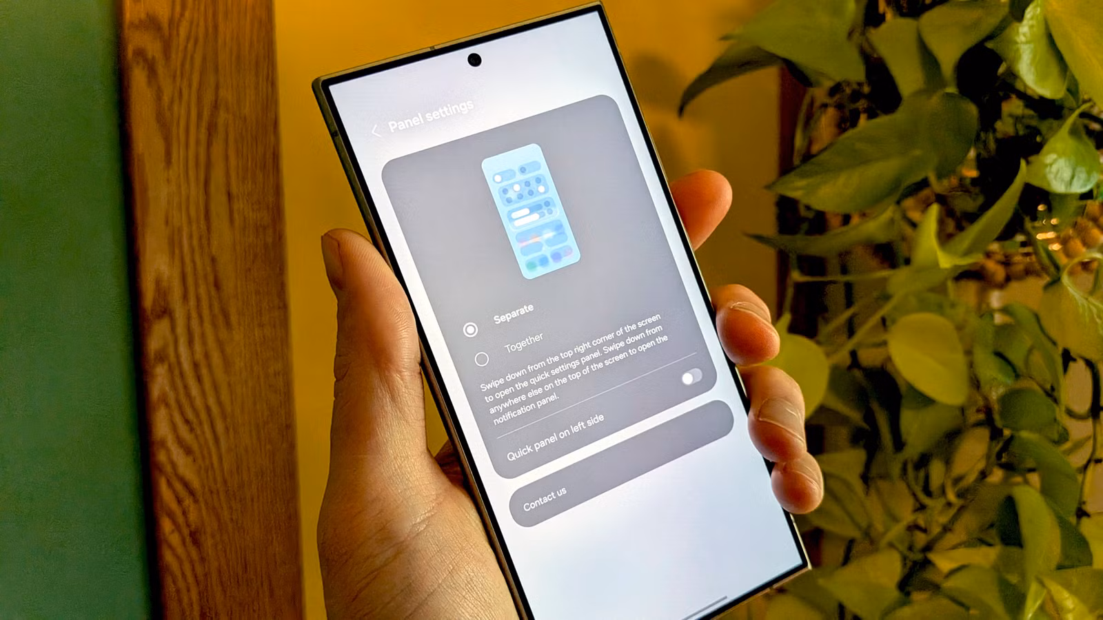
- Samsung's One UI 7 and Google's Android 16 are testing split notification panels that separate Quick Settings from notifications
- Android's unified notification shade has been praised since the T-Mobile G1 in 2008 and remains a key differentiator from iOS
- Users who prefer the classic layout may need to switch to alternative launchers or third-party notification managers
The Change Nobody Asked For
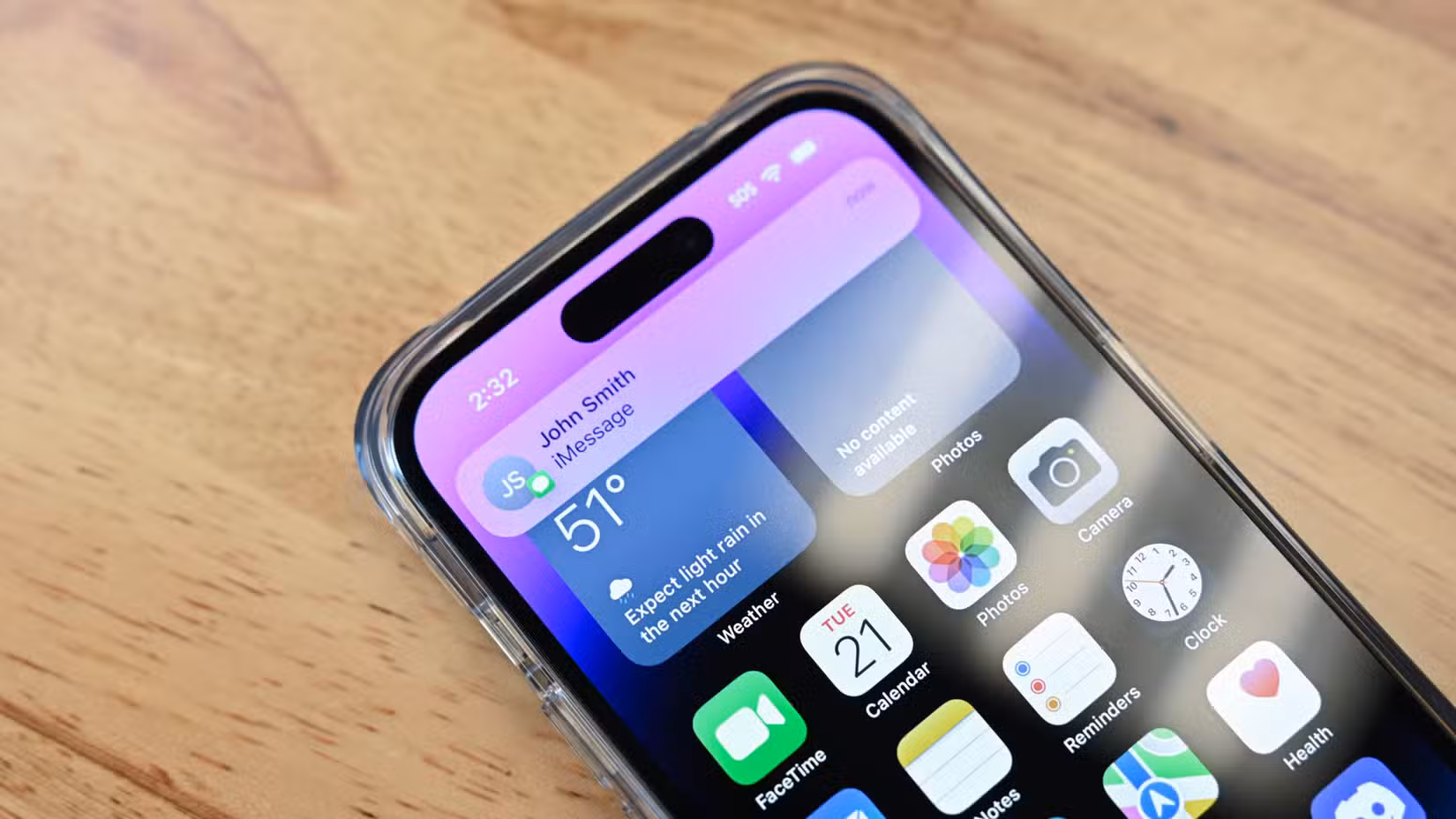
Android's pull-down notification shade is one of those features users take for granted until someone tries to change it. For 15 years, a single swipe from the top of the screen revealed everything: your notifications, your Quick Settings toggles, your entire phone's status at a glance. Now Samsung and Google want to split that experience in two.
The new approach works like the iPhone's Control Center. Swipe down from the left side of the screen, and you see notifications. Swipe down from the right side, and you get Quick Settings. If that sounds familiar, it's because Apple has used this system since iOS 11 in 2017. The question is: why would Android copy something worse?
A 15-Year Design That Actually Worked
When the T-Mobile G1 launched in 2008 as the first Android phone, tech reviewers immediately noticed the notification system. Joshua Topolsky, writing for Engadget, called the pull-down shade "brilliantly executed" and noted that it made "Android the only platform that takes alert organization seriously."
“The real prize is the pull-down curtain, actuated with a downward drag of a finger from the top of the screen, where notifications go to live on a more permanent basis until you delete them. The great thing about this screen is that each notification has room to stretch out and display plenty of details.”
— Joshua Topolsky, Engadget (2008)
The Quick Settings toggles for Wi-Fi, Bluetooth, and Airplane Mode arrived with Android 4.2 Jelly Bean. But the system we know today, where one swipe shows a few key toggles above your notifications and a second swipe expands the full Quick Settings grid, came with Android 7.0 Nougat in 2016.
This design has a clear logic. Most of the time, you want to see notifications. Occasionally, you need to toggle a setting. The two-swipe system handles both cases without requiring you to remember which side of the screen does what.
Why the Split System Makes Everything Worse
The unified panel works because it respects how people actually use their phones. You glance at the top of the screen, you swipe down, you see what you need. The split system adds cognitive load. Now you have to think about which side to swipe from before you swipe.
This sounds minor until you're driving with one hand on the wheel, or holding a coffee, or lying in bed with your phone at an awkward angle. The split system turns a reflexive gesture into a choice. Worse, it's the same choice every time, and getting it wrong means an extra swipe to get where you wanted.
The iPhone has an excuse. Apple's approach grew out of design decisions made when the notch arrived and screen real estate became complicated. Android phones have copied the notch and the hole-punch, but they never had to copy this specific UX compromise.
Who's Doing This and When
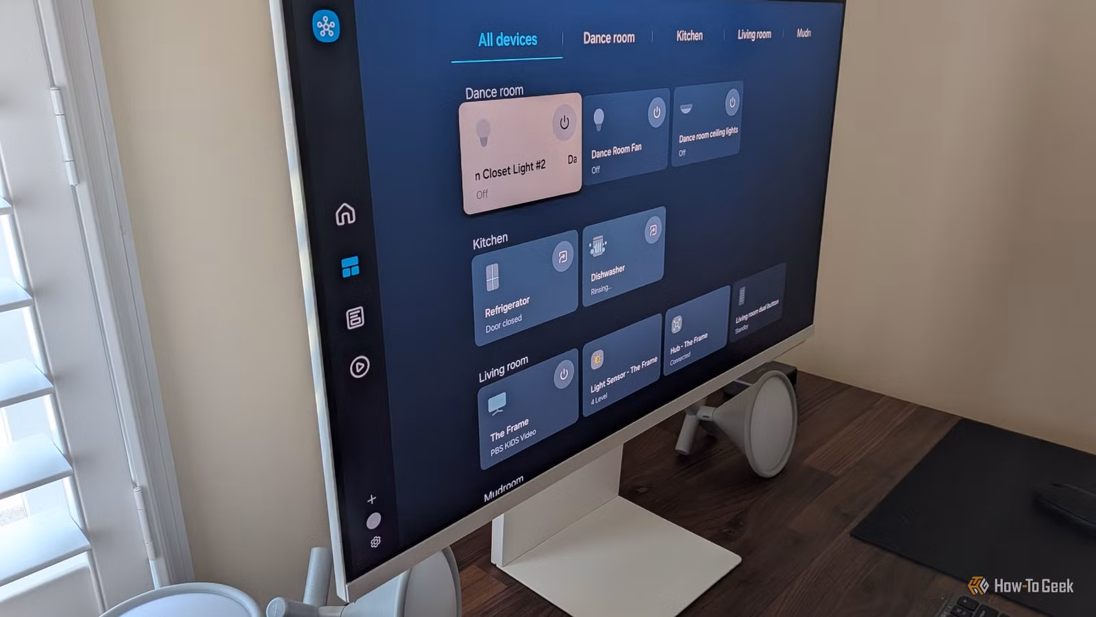
Samsung's One UI 7 introduced the split panel option. Google appears to be testing something similar in Android 16. Neither company has committed to making this the only option, but the fact that they're experimenting at all signals a direction.
The charitable interpretation: both companies see this as a way to declutter the notification experience. When you have 30 unread notifications, having Quick Settings tiles mixed in does create visual noise. The less charitable interpretation: iPhone does it, so it must be right.
Logicity's Take
What Users Can Do About It
If your phone ships with a split notification panel and you hate it, you have options. Some manufacturers include a toggle to restore the classic behavior in settings. If yours doesn't, third-party launchers like Nova Launcher or Niagara Launcher often maintain their own notification handling.
Apps like Power Shade and Material Notification Shade can replace the system notification panel entirely. These solutions aren't as seamless as the built-in experience, but they exist because Android, unlike iOS, lets users swap out core system components.
- Check Settings > Notifications for a panel style toggle
- Try third-party launchers that maintain classic notification behavior
- Use notification replacement apps like Power Shade
- Send feedback through Samsung Members or Google's Android beta program
The irony is that the very flexibility that lets users work around bad design decisions is what makes Android worth using. If Samsung and Google continue down this path, that flexibility becomes a bug fix rather than a feature.
For readers who enjoy customizing their tech experience
Frequently Asked Questions
What is Android's split notification panel?
A new design being tested by Samsung and Google where swiping down from the left side of the screen shows notifications, while swiping from the right shows Quick Settings. This replaces the traditional unified panel.
Which phones have the split notification panel?
Samsung phones running One UI 7 have introduced this option. Google is testing similar functionality in Android 16 beta builds.
Can I switch back to the old Android notification style?
Depending on your phone, there may be a toggle in Settings > Notifications. If not, third-party launchers and notification replacement apps can restore the classic behavior.
Why is Android copying iPhone's notification system?
The official reasoning is unclear. It may be an attempt to declutter the notification experience, or simply following Apple's design trends. Many long-time Android users consider it a step backward.
Need Help Implementing This?
Source: How-To Geek
Google Announces AI-Powered Tool to Port iPhone Apps to Android
The new article introduces Google's 'Migration Assistant' for Android Studio, an AI-powered tool announced at Google I/O 2026 that natively ports iPhone apps to Android. This is a significant technological development that addresses app parity issues, a topic not mentioned in the original article.
Huma Shazia
Senior AI & Tech Writer
Produced with AI assistance and reviewed by the Logicity editorial team. Learn more in our Editorial Policy.