Key Takeaways
- Windows high contrast mode overrides all apps and browsers with a strict black, white, and neon palette for maximum legibility
- You'll lose wallpapers, transparency, drop shadows, and gradients when you enable it
- About 30% of people have astigmatism, which can make pure black backgrounds cause text to 'bleed' and strain eyes faster
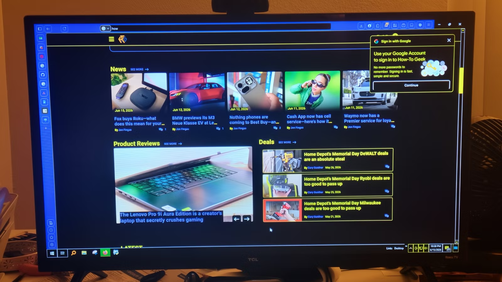
Windows dark mode swaps bright whites for deep grays, but it doesn't go far enough for users who want true black. The solution isn't a third-party app. It's a built-in feature called high contrast mode, now branded as Contrast Themes in Windows 11, that strips your interface down to stark blacks, whites, and neon accents.
The catch: you'll sacrifice nearly every visual flourish Windows offers. Wallpapers disappear. Transparency effects vanish. Drop shadows and gradients get erased entirely. This isn't a cosmetic tweak. It's a fundamental change to how your OS renders everything on screen.
How does Windows high contrast mode work differently?
Standard dark mode and high contrast mode share a goal of reducing eye strain, but they achieve it through opposite methods. Dark mode aims for visual comfort. It softens the interface with muted tones, reduces blue light emission, and keeps everything looking polished. The design philosophy is gentle.
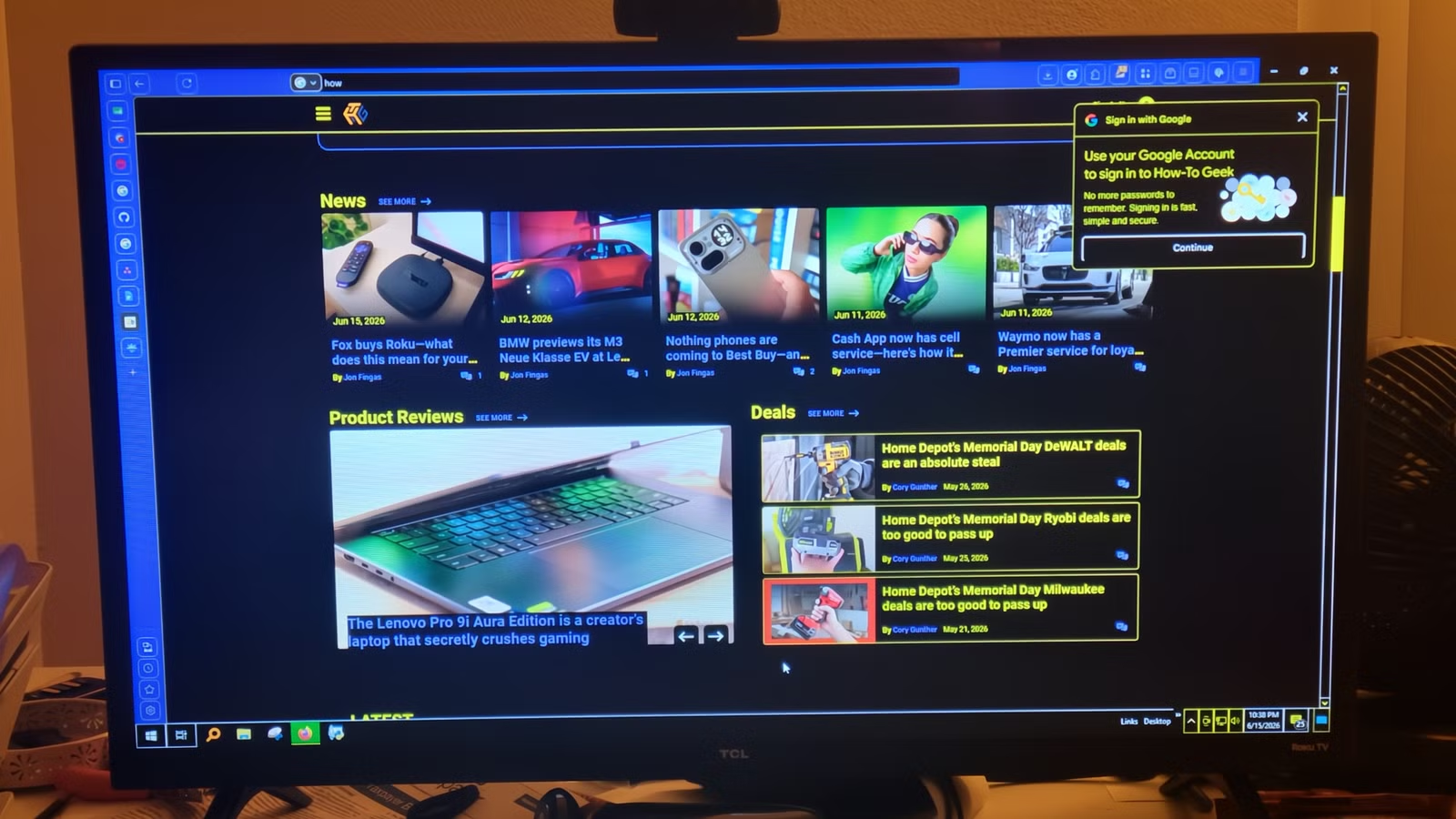
High contrast mode doesn't care about polish. When you enable it, Windows overrides the color schemes in your browser, your apps, and even carefully authored CSS on websites. The OS forces a restricted palette of system colors onto everything. The only priority is legibility.
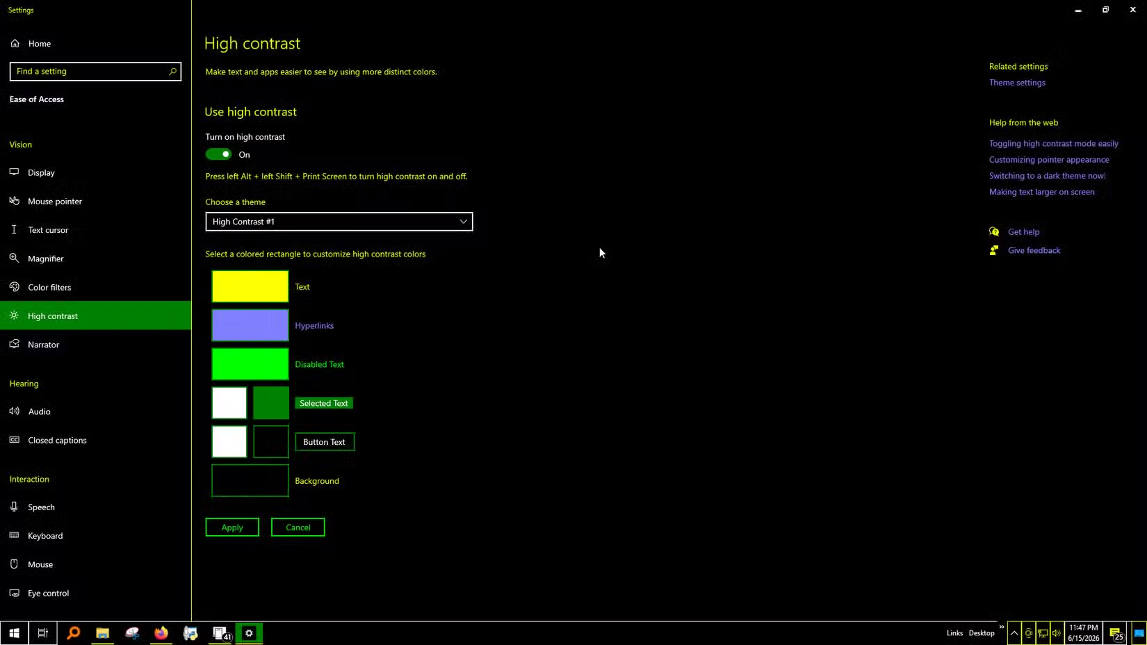
Windows 11 offers four distinct Contrast Themes in Accessibility settings. Each uses a different combination of blacks, whites, and accent colors. You can customize these further, picking exact hues for text, hyperlinks, and UI elements.
What do you lose when you enable it?
The trade-offs are significant. Your desktop wallpaper becomes a flat black surface. The acrylic transparency effects Microsoft introduced in Windows 11 are gone. Every drop shadow and gradient that gave depth to windows and buttons gets stripped out.
Web browsing can break. Many sites have CSS that doesn't account for high contrast mode. Text that was readable on a standard theme might become invisible when Windows overrides the page colors. Poorly optimized web elements are the most common complaint in Reddit threads discussing this workaround.
Power users in r/Windows11 and r/Monitors often accept these limitations for terminal and coding work, where the stark contrast makes text easier to parse for hours. Designers and media consumers warn against it because the visual inconsistencies become distracting.
Is pure black actually better for your eyes?
Not always. About 30% of the population has astigmatism, a condition that makes bright text on pure black backgrounds appear to glow or bleed around the edges. This phenomenon, called halation, can cause faster eye fatigue than standard dark mode's softer grays.
The deep gray backgrounds in standard dark mode exist for this reason. They reduce the contrast ratio enough to minimize halation while still being easier on the eyes than a white screen. For users without astigmatism, true black might feel better. For others, it's actively worse.
How to enable Contrast Themes in Windows 11
Open Settings, navigate to Accessibility, then select Contrast Themes. Choose from one of the four presets: Aquatic, Desert, Dusk, or Night Sky. Each applies immediately. You can further customize any theme by clicking Edit to change individual color values for backgrounds, text, hyperlinks, and button text.
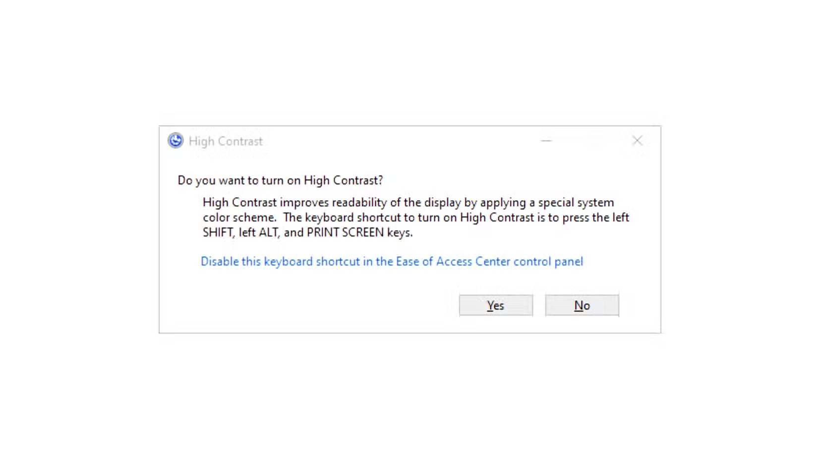
The keyboard shortcut Left Alt + Left Shift + Print Screen toggles high contrast on and off. This is useful for switching quickly when you encounter a website or app that renders poorly under the forced color scheme.
Another workaround that solves a limitation standard features ignore
Who should actually use this?
High contrast mode was designed as an accessibility feature for users with visual impairments. It excels at making text readable when standard themes fail. But it's also found an audience among developers and writers who spend long hours staring at code or prose and want maximum clarity without distractions.
If you use Windows primarily for visual work, video editing, photo processing, or design tasks, high contrast mode will interfere with accurate color representation. The forced palette overrides what you're trying to see.
Logicity's Take
Microsoft ships Contrast Themes as an accessibility feature, but they've quietly become a power-user tool for anyone who finds dark mode too timid. The real question is whether Microsoft will eventually offer a middle ground: a true-black theme that doesn't nuke your entire visual hierarchy. Until then, toggling between modes with the keyboard shortcut is the pragmatic solution.
Frequently Asked Questions
Does high contrast mode work with all Windows apps?
It works with most apps, but it overrides their color schemes. Some apps and websites may render poorly because their CSS doesn't account for system color overrides.
Can I customize the colors in Windows high contrast mode?
Yes. In Windows 11, go to Settings > Accessibility > Contrast Themes, select a theme, and click Edit to change individual colors for backgrounds, text, and hyperlinks.
Is high contrast mode the same as dark mode?
No. Dark mode uses soft grays to reduce brightness while keeping visual polish. High contrast mode forces a strict black and white palette with neon accents, prioritizing legibility over aesthetics.
Will high contrast mode help with eye strain?
It depends. For some users it improves readability. For the 30% of people with astigmatism, pure black backgrounds can cause text to appear blurry or glowing, which increases eye fatigue.
How do I quickly toggle high contrast mode on and off?
Press Left Alt + Left Shift + Print Screen to instantly switch between high contrast mode and your normal theme.
Need Help Implementing This?
If you're configuring workstations for accessibility compliance or setting up developer environments with optimized display settings, Logicity.in covers the tools and techniques that matter. Subscribe for more practical guides.
Source: How-To Geek
Manaal Khan
Tech & Innovation Writer
Produced with AI assistance and reviewed by the Logicity editorial team. Learn more in our Editorial Policy.