Key Takeaways
- Convert raw data to column or line charts using Ctrl+T tables for automatic updates
- Use sparklines to show trends inside individual cells without creating full charts
- Conditional formatting with color gradients makes outliers visible at a glance
Large tables of numbers in Excel are hard to read. You scroll, you squint, you lose your place. But turning that data into something visual does not require a design degree or hours of formatting. A few built-in Excel features can transform a wall of figures into charts, sparklines, and color-coded tables in minutes.
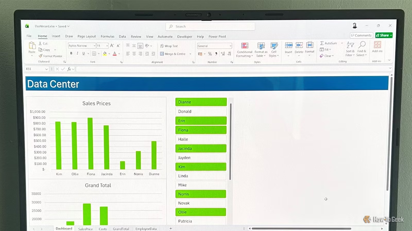
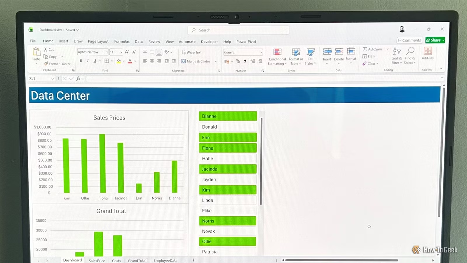
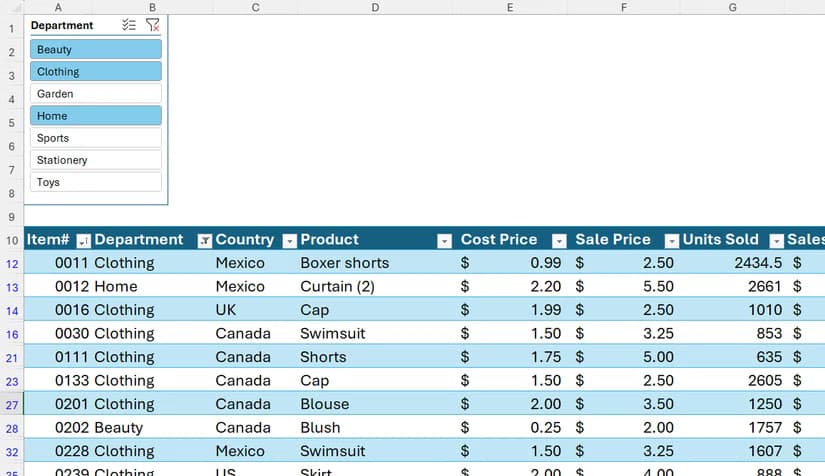
Tony Phillips at How-To Geek walks through six visualization techniques that take under 10 minutes each. All of them work best when your data lives in an Excel table (Ctrl+T), which keeps formulas dynamic and updates related visuals automatically when your data changes.
Column and Line Charts: The Fastest Option
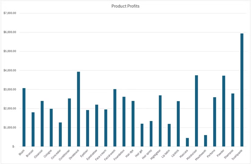
Charts remain the quickest way to turn spreadsheet data into something visual. Select the columns you want to visualize, say "Product" and "Profit," then open the Insert tab. Pick a Clustered Column chart to compare values across categories, or a Line chart to show trends over time.
Excel generates a basic visual from your selection. Right-click any chart element to format it, or use the + button (Chart Elements menu) to add titles, labels, and gridlines. The Quick Analysis shortcut (Ctrl+Q) lets you preview charts instantly without navigating menus.
PivotCharts for Summarized Data
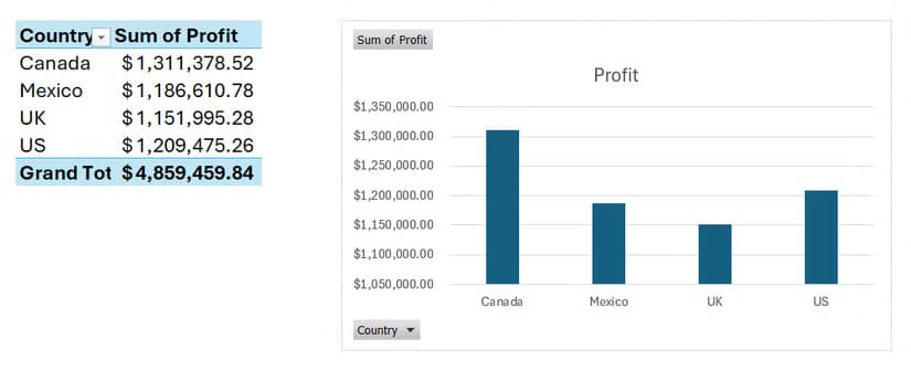
When your data needs grouping before charting, PivotTables paired with PivotCharts handle both steps. Create a PivotTable from your data, drag fields into rows and values, then insert a PivotChart. The chart updates automatically as you filter or rearrange the PivotTable.
This approach works well for summarizing sales by region, profits by product category, or any scenario where you need aggregated totals rather than row-by-row detail.
Sparklines: Trends Inside Cells
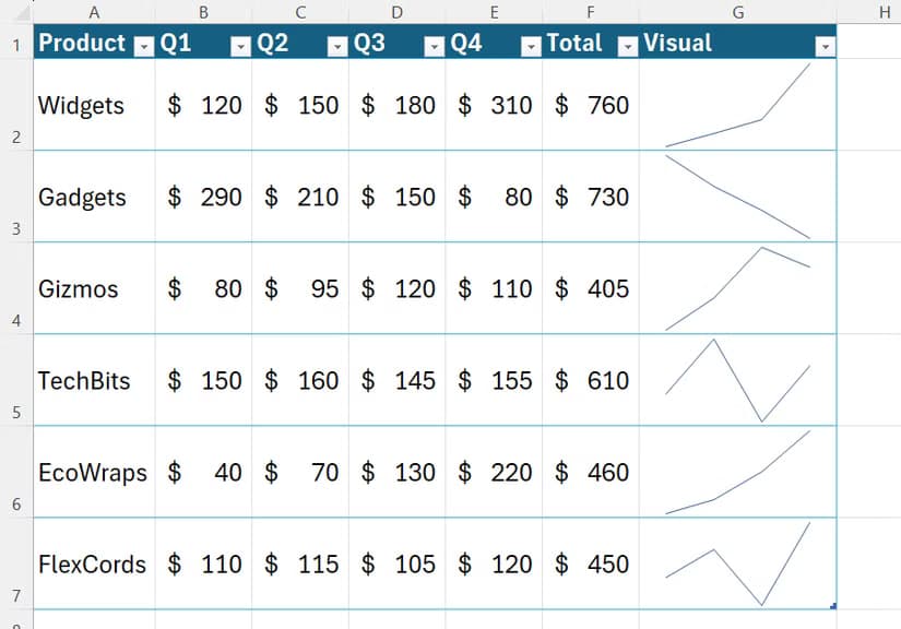
Sparklines are miniature charts that fit inside a single cell. They show trends without taking up chart real estate. Select a cell where you want the sparkline to appear, go to Insert > Sparklines, then choose Line, Column, or Win/Loss style.
Point the sparkline at a row of data, monthly sales figures for example, and Excel draws a tiny trend line. These work well in summary tables where each row represents a different product, region, or time period.
Conditional Formatting with Color Gradients
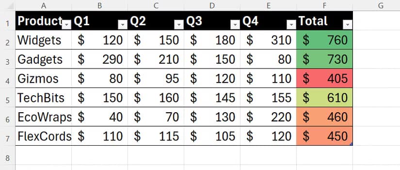
Color scales turn number columns into heat maps. Select a column of values, go to Home > Conditional Formatting > Color Scales, and pick a gradient. Excel applies colors based on value, making high and low numbers visible at a glance.
This technique helps spot outliers in large datasets. A red-yellow-green gradient, for instance, immediately shows which sales figures lag and which lead without reading each number.
Data Bars for In-Cell Comparisons
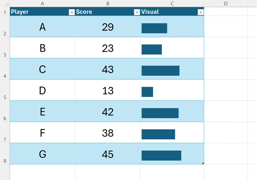
Data bars add horizontal bars inside cells, proportional to each value. They function like a bar chart embedded in your table. Select a column, go to Conditional Formatting > Data Bars, and choose a color. Larger values get longer bars.
Data bars work best for comparing magnitudes across rows, showing which products sell more or which months had higher revenue, without building a separate chart.
Icon Sets for Quick Status Indicators
Icon sets add symbols, arrows, traffic lights, or checkmarks, based on cell values. They turn numbers into status indicators. Go to Conditional Formatting > Icon Sets, pick a style, and Excel assigns icons based on thresholds you can customize.
A green up-arrow might indicate growth above 10%, yellow for flat, red for decline. This approach suits dashboards where viewers need quick status reads rather than exact figures.
When to Use Which Visualization
- Column/Line charts: comparing categories or showing trends over time
- PivotCharts: summarized or grouped data needing aggregation
- Sparklines: embedding trends in tables without separate charts
- Color scales: spotting outliers in large numeric columns
- Data bars: in-cell magnitude comparisons
- Icon sets: status dashboards with quick visual flags
Logicity's Take
Frequently Asked Questions
Do I need to use Excel tables for these visualizations?
Not strictly, but Excel tables (Ctrl+T) make charts and sparklines update automatically when you add new data. Without tables, you manually adjust ranges each time.
Can I combine multiple visualization types in one spreadsheet?
Yes. A common approach uses conditional formatting in your data table plus a summary chart above or beside it. Sparklines can sit in a summary column while a full chart provides the overview.
Do these techniques work in Excel for Mac?
All six techniques work in Excel for Mac. The ribbon layout differs slightly, but the features, Insert > Chart, Conditional Formatting, Sparklines, exist in the same locations.
What's the fastest way to create a chart in Excel?
Select your data and press Ctrl+Q to open Quick Analysis. Click the Charts tab to preview options instantly without navigating menus.
Another productivity-focused guide on underused software features
Need Help Implementing This?
Source: How-To Geek
Huma Shazia
Senior AI & Tech Writer
Produced with AI assistance and reviewed by the Logicity editorial team. Learn more in our Editorial Policy.