Key Takeaways

- Human brains struggle to compare angles and areas, making pie charts ineffective for close values
- 3D chart effects distort data perception and should be replaced with flat 2D versions
- Bar and column charts outperform circular layouts for categorical comparisons
Excel makes it easy to turn numbers into visuals. But "easy" doesn't mean "accurate." Some chart types hide your data more than they highlight it. If you want reports that communicate clearly, stop using these five layouts.
Pie Charts: Circular Data Is a Recipe for Confusion
You have a handful of categories. You click that colorful circle in the Insert tab. It looks friendly. It feels like the right thing to do. But the pie chart is one of the most misused tools in the spreadsheet kit.
The fundamental problem is biological. Human brains are surprisingly bad at judging angles and comparing areas. Research by statisticians Cleveland and McGill on graphical perception shows we're much better at comparing the heights of two bars than figuring out whether one slice is slightly larger than another.
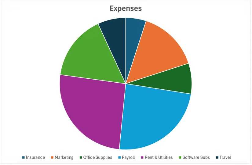
When values are close, pie charts turn into interpretation guesswork. Cleveland and McGill put it directly: the visualization "fails if the decoding process fails." The problem worsens as you add categories. Beyond three or four segments, you end up with a cluttered ring of slivers. You need labels, leader lines, and a legend just to decode what you're looking at. At that point, the visual has stopped communicating.
Pie charts only work when you have two or three categories and the differences are obvious at a glance. Otherwise, skip them.
What to Use Instead
3D Charts: Visual Flair That Distorts Your Data
Excel offers 3D versions of most chart types. They look polished in presentations. They also systematically distort how people read your data.
The problem is perspective. In a 3D column chart, bars at the back appear shorter than bars at the front, even when they represent the same value. Readers have to mentally adjust for depth, which introduces errors. The visual effect overrides the actual numbers.
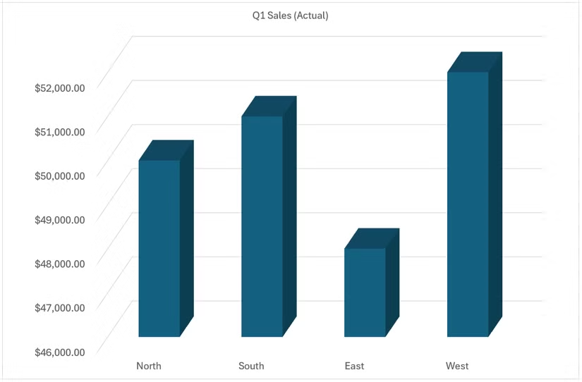
This isn't a subtle issue. A bar representing $50,000 can look smaller than a bar representing $45,000 simply because of its position in the 3D space. You're asking readers to do mental geometry instead of reading your data.
What to Use Instead
Dual-Axis Charts: Two Scales, Twice the Confusion
Dual-axis charts plot two data series with different scales on the same graph. Website visits on the left axis, marketing spend on the right. It seems efficient. It's often misleading.
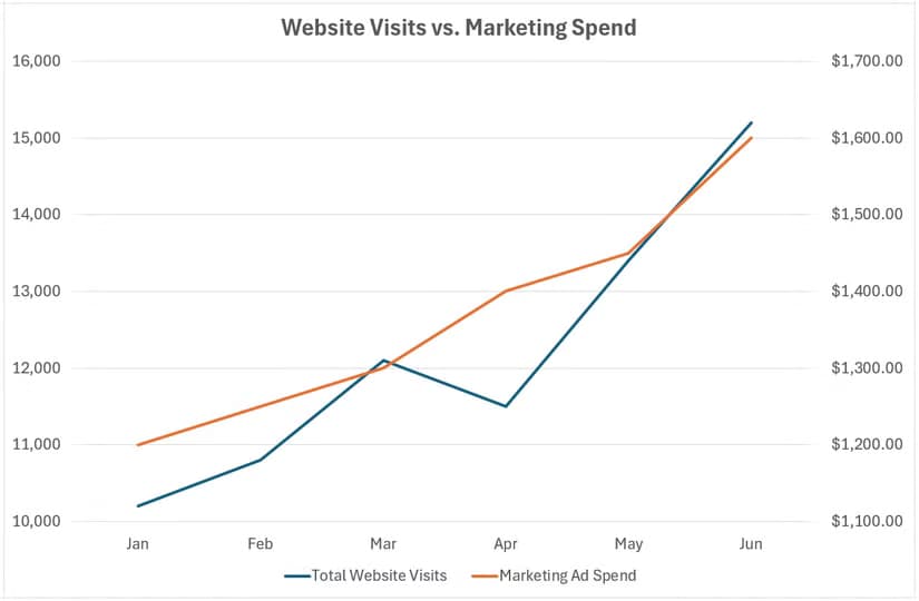
The danger is that you control both scales independently. You can make any two trends appear correlated by adjusting the axis ranges. Website visits went up while marketing spend went up? Adjust the scales until the lines cross at dramatic moments. The visual suggests causation. The data may not support it.
Readers instinctively compare the heights and slopes of lines on the same chart. When those lines use different scales, that comparison is meaningless. But the brain makes it anyway.
What to Use Instead:
Radar Charts: Spider Webs Nobody Can Read
Radar charts (also called spider charts) plot multiple variables on axes radiating from a center point. They're popular for comparing individuals across metrics. Performance reviews, product comparisons, skill assessments.
The problem appears the moment you add a second data series. Overlapping colored polygons create a visual tangle. Readers can't easily compare values on any single axis, let alone across axes. The "spider web" effect looks sophisticated but communicates poorly.
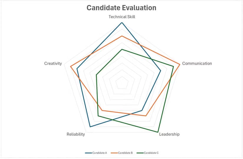
There's also an ordering problem. The shape of the polygon changes based on how you arrange the axes. Rearrange the metrics, and the same data looks like a completely different pattern. That's a sign the visual form isn't tied to the underlying meaning.
What to Use Instead:
Stacked Area Charts: Where Did My Data Go?
Stacked area charts show how multiple categories contribute to a total over time. They look impressive when filled with gradient colors. They're also remarkably hard to read accurately.
The bottom series sits on the baseline. You can read its values directly. Every series above it sits on a shifting foundation. To read the actual value of the third series at any point, you'd need to subtract the heights of the two series below it. Nobody does this mentally while scanning a chart.
The result: readers can see the total trend and the bottom series trend. Everything else becomes visual noise. If one of those middle categories is the point of your analysis, you've buried it.
What to Use Instead:
The Underlying Principle
These five chart types share a common flaw. They prioritize visual variety over perceptual accuracy. They make your spreadsheet look different without making your data clearer.
The Cleveland and McGill research provides a ranking of how accurately humans decode visual encodings. Position along a common scale (bar charts) beats position along identical but non-aligned scales (small multiples), which beats length (pie chart radii), which beats angle (pie slices), which beats area (bubble charts).
Every chart type on the "avoid" list relies on encodings near the bottom of that hierarchy. Every recommended alternative moves up the hierarchy toward position comparisons.
- Pie charts encode data as angles and areas. Bar charts encode as positions.
- 3D charts distort positions with perspective. 2D charts preserve them.
- Dual-axis charts make position comparisons meaningless. Separate charts restore them.
- Radar charts force circular position reading. Grouped bars use linear positions.
- Stacked areas hide positions under shifting baselines. Lines and bars expose them.
When Rules Have Exceptions
Pie charts work for two or three categories with large differences. A 70/30 split reads fine as a pie. Radar charts work when the polygon shape itself is the insight, not the individual values. "This candidate has a balanced profile" is a legitimate radar chart use case.
The test is simple: can a reader get your point in three seconds without reading labels? If yes, the chart works. If readers need to decode, calculate, or squint, pick something else.
Logicity's Take
Frequently Asked Questions
When is a pie chart actually appropriate in Excel?
Pie charts work when you have two or three categories with obviously different proportions, like a 70/20/10 split. If readers need to compare similar-sized slices or decode more than four segments, switch to a bar chart.
Why do 3D charts distort data perception?
3D perspective makes elements at the back of the chart appear shorter than elements at the front, even when they represent equal values. Readers unconsciously adjust for depth, introducing interpretation errors.
What's the best Excel chart for comparing categories?
Bar charts for horizontal comparisons, especially with long labels. Column charts for vertical comparisons with short labels. Both let readers compare positions along a common scale, which humans process accurately.
How do I show two datasets with different scales in Excel?
Instead of a dual-axis chart, create two separate charts stacked vertically with aligned time axes. This prevents the visual manipulation that dual axes enable while letting readers compare trends honestly.
Are there any valid uses for radar charts?
Radar charts work when the overall polygon shape is your message, not the individual metric values. Showing that a candidate has a 'balanced profile' across skills is valid. Comparing specific scores across people is not.
Need Help Implementing This?
Source: How-To Geek
Manaal Khan
Tech & Innovation Writer
Produced with AI assistance and reviewed by the Logicity editorial team. Learn more in our Editorial Policy.