Python Plotting: How to Build Better Charts Than Excel
Key Takeaways
- Seaborn reduces boilerplate code by up to 90% compared to raw Matplotlib
- Pixi makes setting up a Python plotting environment painless across macOS, Linux, and Windows
- Python visualizations are reproducible and scriptable, unlike manual Excel chart editing
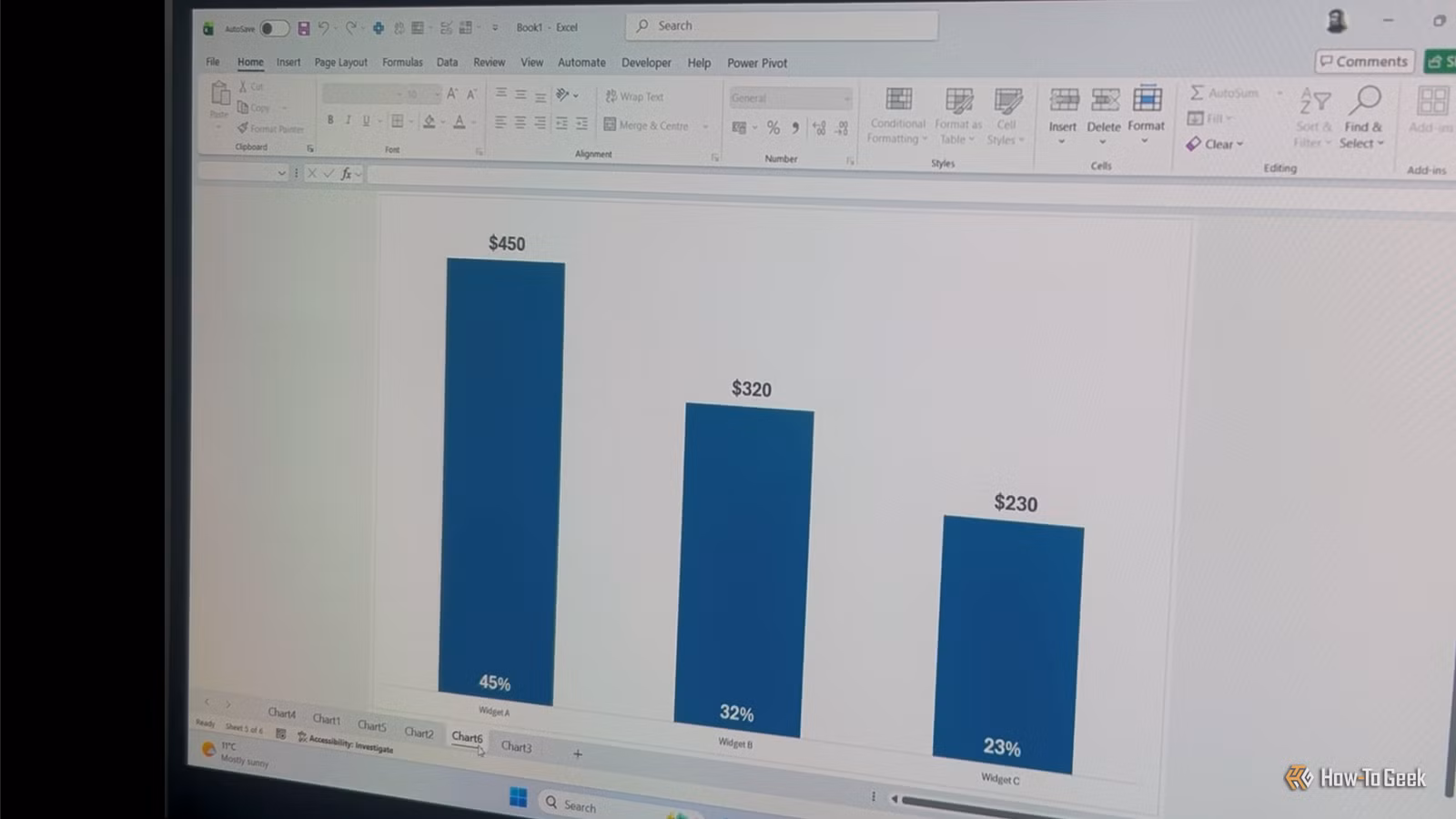
Excel remains the default tool for business charts because it's already on everyone's computer. You can drag some cells, click a chart type, and have something presentable in minutes. But that convenience comes with limits: try updating 50 charts when the data changes, or creating a consistent visual style across a 200-page report.
Python's plotting libraries solve these problems. Scripts run the same way every time. Styles apply consistently. And once you've written the code, regenerating charts with new data takes seconds instead of hours.
The Core Libraries You Need
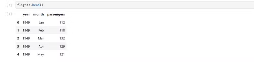
A working Python visualization setup requires four main packages. NumPy handles numerical operations. Pandas manages tabular data through DataFrames. Matplotlib provides the foundational plotting engine. Seaborn sits on top of Matplotlib and makes it easier to create attractive charts with less code.
Two additional tools make the workflow smoother: IPython for interactive coding, and Jupyter Notebooks for documenting your analysis in shareable formats.
Setting Up Your Environment with Pixi
Environment management used to be Python's biggest headache. Pixi simplifies this. It works on macOS, Linux, and Windows PowerShell, and handles package installation without the dependency conflicts that plague pip and conda setups.
Install Pixi following the instructions on the official Pixi website, then run this single command to set up your global graphics environment:
pixi global install --environment graphics --expose jupyter --expose ipython jupyter numpy pandas seaborn matplotlib ipythonThis installs Jupyter, IPython, NumPy, Pandas, Seaborn, and Matplotlib in one shot. The --expose flag ensures IPython's executable is available to Jupyter. Since Matplotlib is a Seaborn dependency, it would install anyway, but explicitly including it guarantees you can issue Matplotlib commands directly when needed.
Why Seaborn Over Raw Matplotlib?
Matplotlib gives you complete control over every pixel. That power comes at a cost: even simple charts require multiple lines of configuration. Seaborn wraps Matplotlib with sensible defaults and a theme-based API that cuts boilerplate code by roughly 90%.
“The goal of visualization is not just to make charts, but to make information accessible, understandable, and actionable for decision-makers.”
— Hadley Wickham, Chief Scientist at Posit
For most business reporting, Seaborn's defaults look better out of the box than what you'd build manually in Matplotlib. When you need pixel-level control, you can drop down to Matplotlib for specific adjustments while keeping Seaborn's aesthetic foundation.
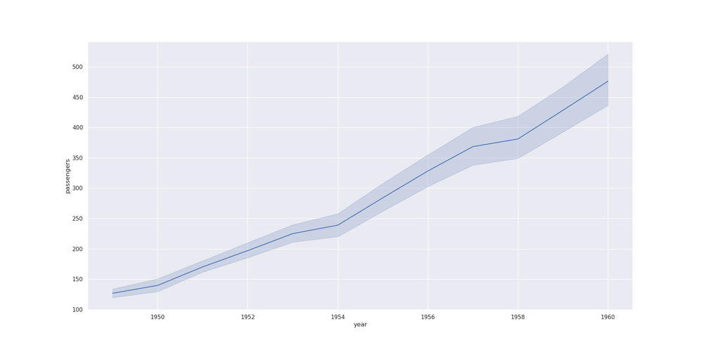
Chart Types That Matter for Business Reporting
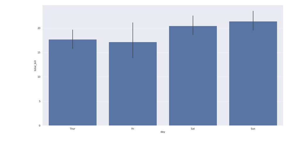
Most business visualizations fall into a few categories: trends over time (line charts), categorical comparisons (bar charts), and relationships between variables (scatter plots). Seaborn handles all of these with minimal code.
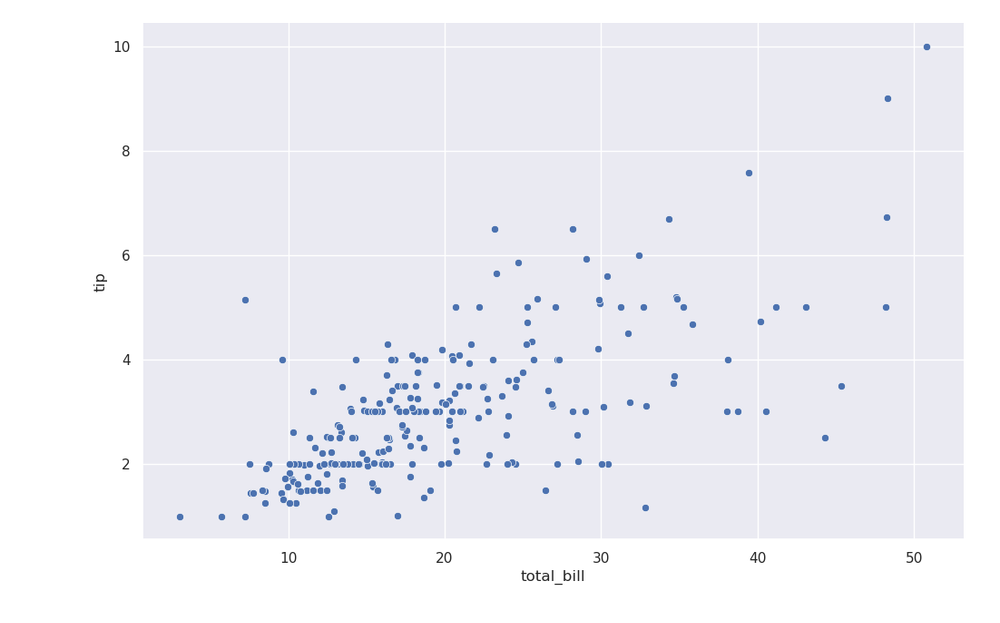
Bar plots work well for comparing totals across categories, such as revenue by department or support tickets by region. Scatter plots reveal correlations, like the relationship between advertising spend and conversions. Line charts track metrics over time, from quarterly sales to daily active users.
Seaborn also supports regression plots that overlay trend lines on scatter data, making it easy to visualize correlations without switching to statistical software.
The Real Advantage: Automation and Reproducibility
The strongest argument for Python over Excel isn't aesthetics. It's automation. A script that generates 50 charts from a CSV file runs in seconds. When the data updates, you re-run the script. No clicking through menus, no manual reformatting, no risk of forgetting to update one chart in a deck of 200 slides.
Reproducibility matters too. Jupyter Notebooks capture your entire analysis: data loading, transformations, and visualizations. You can share the notebook with colleagues, and they'll see exactly how you built each chart. Try doing that with an Excel file where someone manually adjusted axis labels three weeks ago.
When to Stick with Excel
Python isn't always the right tool. For one-off charts that won't be updated, Excel is faster. For stakeholders who need to manipulate the underlying data themselves, a spreadsheet makes more sense. For quick exploration before you know what visualization you need, Excel's point-and-click interface has lower friction.
The breakeven point comes when you're creating charts repeatedly, need consistent styling across many visuals, or want to automate reporting pipelines. At that point, the upfront investment in Python pays off quickly.
✅ Pros
- • Automated chart generation saves hours on recurring reports
- • Consistent styling across hundreds of visualizations
- • Reproducible analysis via Jupyter Notebooks
- • Handles large datasets that slow down Excel
❌ Cons
- • Steeper learning curve than Excel's GUI
- • Requires environment setup and package management
- • Stakeholders may need training to interpret notebooks
Logicity's Take
Frequently Asked Questions
Do I need to know Python to use Matplotlib and Seaborn?
Basic Python knowledge helps, but visualization code is mostly straightforward. You can get productive with just a few hours of tutorial time.
Can I export Python charts to PowerPoint?
Yes. Matplotlib exports to PNG, PDF, and SVG formats, all of which import cleanly into presentation software.
Is Seaborn better than Matplotlib?
Seaborn builds on Matplotlib with better defaults and less boilerplate. Use Seaborn for most charts; drop to Matplotlib when you need fine-grained control.
What's the learning curve compared to Excel?
Expect 10-20 hours to become comfortable with basic plots. The payoff comes when you reuse that code across multiple projects.
Need Help Implementing This?
Source: How-To Geek
Manaal Khan
Tech & Innovation Writer
Related Articles
Browse all
How to Jailbreak Your Kindle: Escape Amazon's Control Before They Brick Your E-Reader
Amazon is cutting off support for older Kindles starting May 2026, but you don't have to buy a new device. Jailbreaking your Kindle lets you install custom software like KOReader, read ePub files natively, and keep your e-reader alive for years to come.

X-Sense Smoke and CO Detectors at Home Depot: UL-Certified Alarms You Can Actually Trust
X-Sense just made their UL-certified smoke and carbon monoxide detectors available at Home Depot stores nationwide. The lineup includes wireless interconnected models that can link up to 24 units, 10-year sealed batteries, and smart features designed to cut down on those annoying false alarms that make people disable their detectors entirely.

How to Change Your Browser's DNS Settings for Faster, Private Browsing in 2026
Your browser's default DNS settings are probably slowing you down and leaking your browsing history to your ISP. Here's why changing this one setting should be the first thing you do on any new device, and how to pick the right DNS provider for your needs.
Raspberry Pi at 15: Why the King of Single-Board Computers Is Losing Its Crown
After 15 years of dominating the hobbyist computing scene, the Raspberry Pi faces serious competition from cheaper alternatives, supply chain headaches, and a market that's evolved past its original mission. Here's what's happening and what it means for your next project.
Also Read
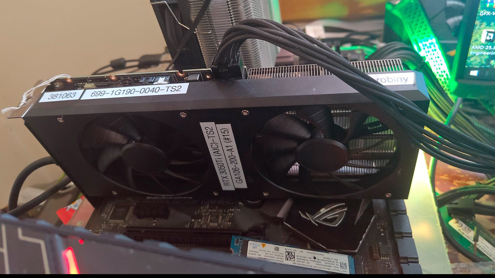
Nvidia RTX 3050 Ti Desktop Prototype Surfaces in Leaked Photos
An engineering sample of a desktop GeForce RTX 3050 Ti has appeared online, revealing a cancelled Ampere GPU that would have slotted between the RTX 3050 and RTX 3060. Hardware leaker Gok shared photos and benchmarks of the prototype, which Nvidia apparently shelved during the pandemic-era GPU shortage.

3 Hulu Shows to Stream This Weekend: June 5-7 Picks
Hulu's June 5-7 weekend lineup brings Mindy Kaling's Gen Z workplace comedy 'Not Suitable for Work,' the fifth season of 'Welcome to Wrexham,' and the critically acclaimed return of 'Deli Boys.' Here's what to watch and why each show deserves your time.

xAI Trained on Claude Outputs for Months Before Anthropic Cut Access
Elon Musk's xAI spent months distilling Anthropic's Claude to train its Grok coding models, according to The Information. After Anthropic revoked official API access in January, xAI engineers continued through personal accounts and third-party services. The company now rents its massive GPU infrastructure to Anthropic and Google instead of training frontier models.