Key Takeaways

- Data2Story uses seven specialized AI agents to transform CSV files into full interactive articles with built-in source verification
- The Inspector panel makes 93% of statements traceable to code or external sources, compared to 25% in human-written data journalism
- In reader tests across 18 article pairs, 74% preferred the AI-generated version, though it tied with highly designed Pudding articles
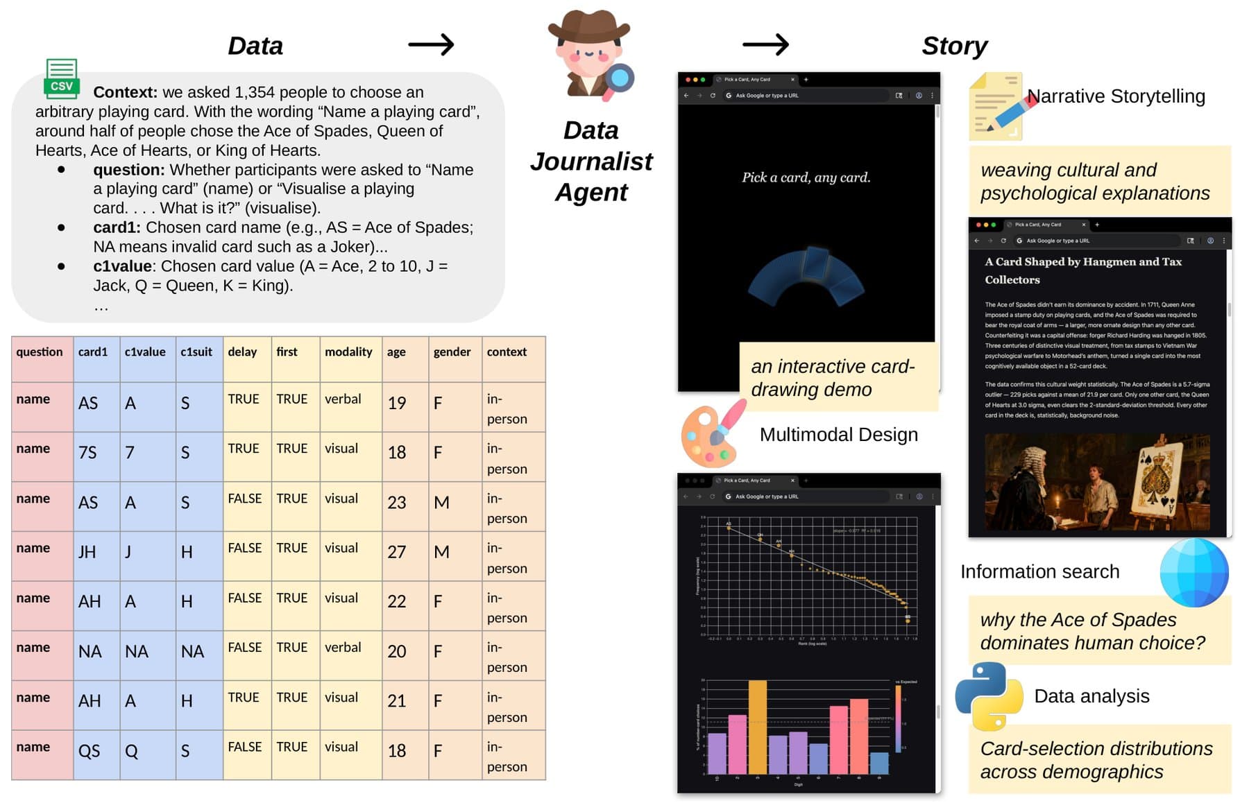
Researchers from Oxford and Stanford have built Data2Story, a Claude Code skill that converts a CSV file into a complete interactive news article. The system uses seven specialized AI agents working in sequence, and its standout feature is an Inspector panel that links 93% of all visible statements back to their source code or external references.
Data journalism remains one of the most labor-intensive beats in any newsroom. A single investigation can consume weeks of analyst and reporter time. Data2Story aims to automate most of that workflow without sacrificing the ability to verify claims.
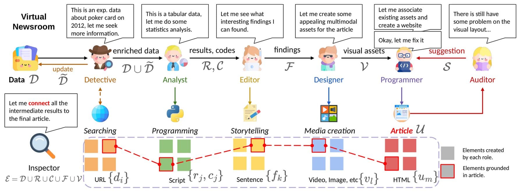
How does the seven-agent pipeline work?
The architecture resembles a virtual newsroom where each agent handles a distinct editorial function. The Detective runs web searches to gather context, since a raw table rarely tells the full story. For a demo using 2026 FIFA World Cup schedule data, it linked host cities to FIFPRO heat risk ratings and Open-Meteo climate information.
The Analyst writes and runs code rather than estimating numbers. The Editor decides which findings drive the narrative. The Designer picks the right medium for each data point, choosing a map for geographic data or an audio clip for music-related stories. The Programmer builds the HTML page, the Auditor checks layout for errors, and the Inspector ties everything back to sources.
The base model is Claude Opus 4.7 running on Claude Code. For multimedia assets, the system pulls in OpenRouter models including gpt-5.4-image-2, seedance-2.0, and lyria-3-pro-preview.
What makes the Inspector panel different?
The Inspector is the system's core differentiator. Every annotated sentence, chart, and interactive element gets its own index card displaying either the exact line of code (plus the data file behind it) or the external URL backing a claim.
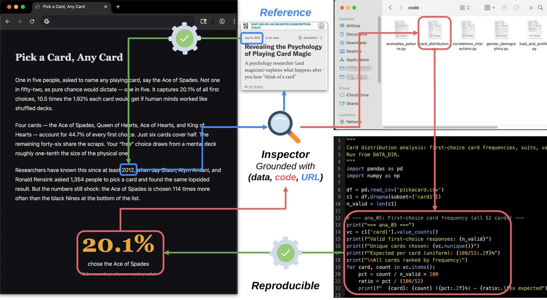
This design lets readers verify 93% of all visible statements. The researchers stress that verifiable does not mean correct. Doubt a figure? Run the code yourself. The baseline for human-written articles is 25%, partly because journalists rarely publish their analysis code alongside stories.
How did it perform against human journalists?
The researchers paired 18 public datasets with matching human-written originals from three sources: concise briefings from The Economist, lavishly designed long reads from The Pudding, and community datasets from TidyTuesday. Fifty-three recruited readers rated both versions across five categories: visual design, narrative rhythm, data transparency, verifiability, and insight gained.
Data2Story won all five categories. The biggest lead was in transparency, scoring +1.49 on a seven-point scale. Overall, 74% preferred the agent article, 25% the human version, and 2% called it a draw.
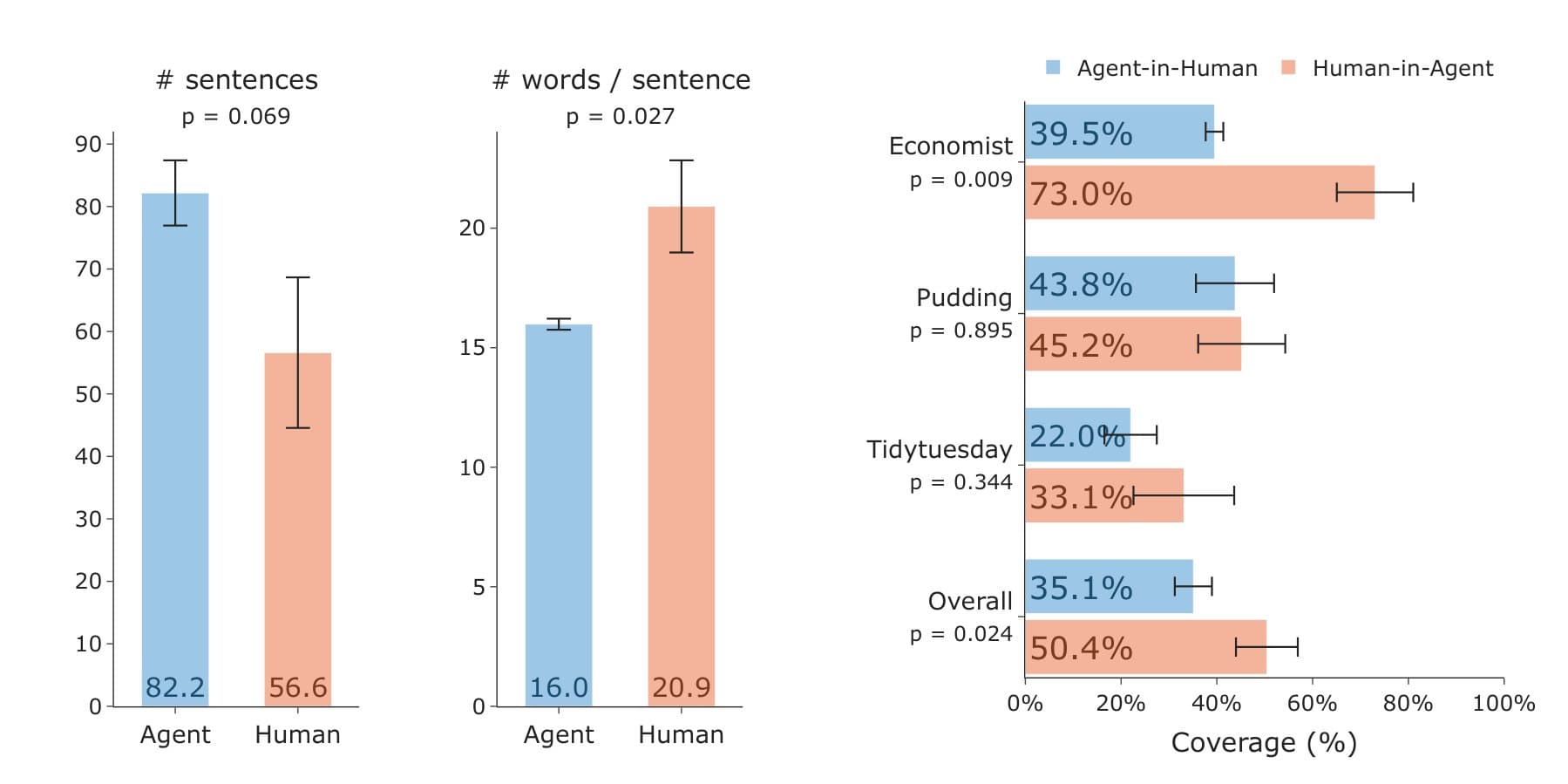
The results split by source type. Data2Story won clearly against data-heavy Economist briefings and TidyTuesday pieces. Against Pudding reports, which design teams often spend weeks crafting, it was a statistical tie. The agent could not beat handcrafted presentation.
Examples: World Cup climate risk and beyond
The researchers demonstrated the system on a dataset that has received little coverage: the 2026 FIFA World Cup schedule. From the schedule and host cities, Data2Story generated a climate-focused article with an interactive map. About four in ten matches are slated for locations that FIFPRO classifies as extremely high heat risk, with humidity rather than air temperature as the main driver. The authors stress these are typical climate conditions, not a forecast for the actual tournament.
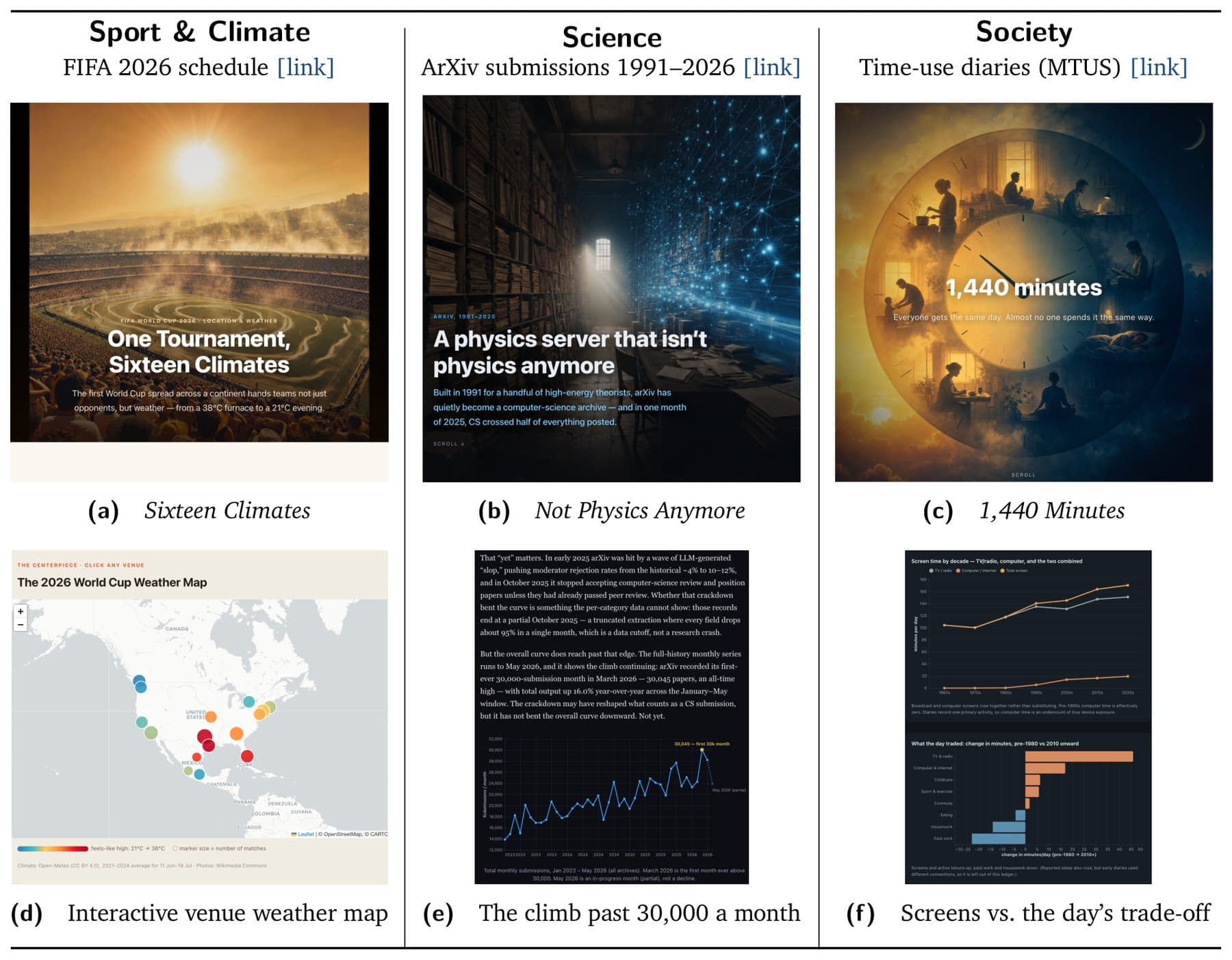
Other demos included ArXiv submission trends from 1991 to 2026 and time-use diary data showing how people spend their day.
Where the agent falls short
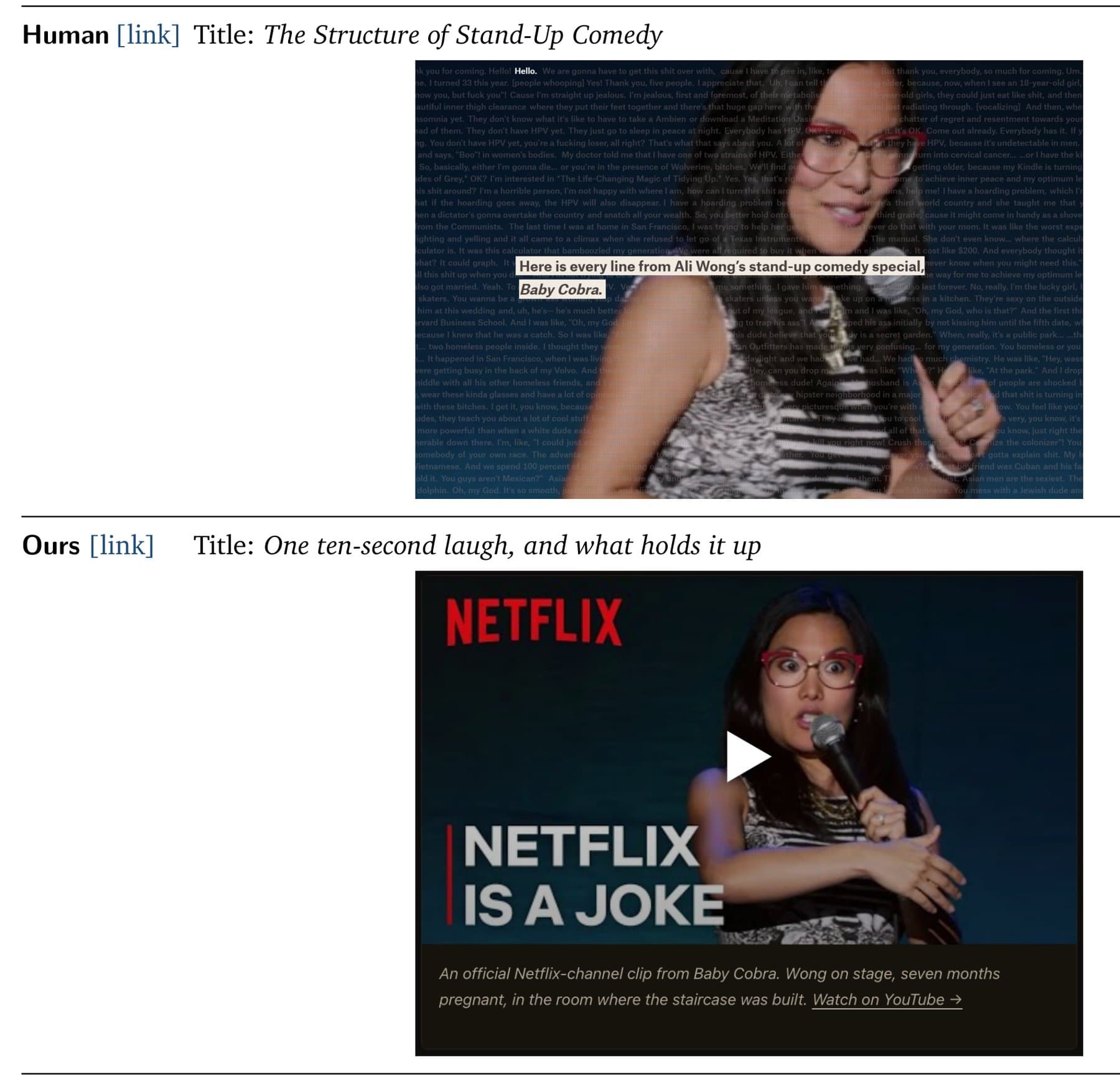
The comparison against The Pudding reveals the system's ceiling. Human designers at The Pudding build bespoke interfaces, like using a full stand-up comedy transcript as a navigable UI element. Data2Story's version defaulted to a static Netflix thumbnail and play button.
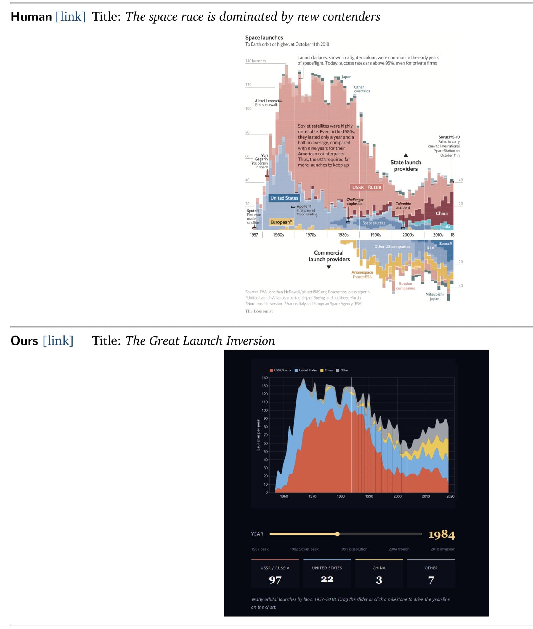
Similarly, an Economist graphic about the space race packed dense annotations into a single view. The agent version used a year slider with bare launch numbers, losing the information density that makes The Economist's visuals distinctive.
When measuring statement overlap, Data2Story covers about half of what appears in the human-written article. Conversely, journalists catch only 35% of the agent's statements. The agent finds more data points but misses contextual framing that experienced reporters add.
Logicity's Take
Data2Story's real innovation is the Inspector, not the automation. Verifiability has been data journalism's Achilles heel because few newsrooms publish their analysis code. A system that bakes source-linking into every output shifts the baseline expectation. For product teams building internal analytics tools or customer-facing data stories, this architecture offers a template: treat evidence chains as first-class outputs, not afterthoughts. The 25% human baseline is an indictment of current practice. Teams using workflow tools like [n8n](https://logicity.in/r/n8n) or [Make](https://logicity.in/r/make) to orchestrate multi-step AI pipelines should note the specialized agent roles here. A single monolithic prompt cannot match seven agents with distinct scopes and handoffs.
Disclosure
Some links in this post are affiliate links — Logicity earns a commission if you sign up, at no extra cost to you. We only link products we have used or actively recommend.
Frequently Asked Questions
What AI model powers Data2Story?
The system runs on Claude Opus 4.7 via Claude Code. For images, video, and audio generation, it pulls in additional models through OpenRouter, including gpt-5.4-image-2, seedance-2.0, and lyria-3-pro-preview.
Can Data2Story replace human data journalists?
Not entirely. It tied with The Pudding's handcrafted articles and missed contextual framing that experienced reporters provide. It excels at data-heavy briefings and transparency but struggles with bespoke visual design.
How does the Inspector panel verify claims?
Every annotated statement, chart, and interactive element gets an index card showing either the exact code line and data file, or the external URL backing the claim. Readers can run the code themselves to reproduce figures.
What datasets did the researchers test?
They used 18 public datasets including the 2026 FIFA World Cup schedule, ArXiv submission trends, time-use diaries, and datasets from The Economist, The Pudding, and TidyTuesday.
What percentage of Data2Story statements are verifiable?
93% of all visible statements can be traced to their origin, compared to 25% in typical human-written data journalism articles.
Need Help Implementing This?
If you're building multi-agent pipelines for automated content or data analysis, Logicity's consulting team can help you architect the workflow. Reach out at consulting@logicity.in.
Source: The Decoder / Jonathan Kemper
Manaal Khan
Tech & Innovation Writer
Produced with AI assistance and reviewed by the Logicity editorial team. Learn more in our Editorial Policy.